Double Page Spread Photo Shoot
This is the photo shoot that I took for my double page spread. Here I am going to show which ones I liked and why I chose to include them.


This is the photo shoot that I took for my double page spread. Here I am going to show which ones I liked and why I chose to include them.

This was the first image that I took for the double page spread. I decided not to use this image because it was took whilst he was moving his hand. I thought that with his hand being positioned over his face made it more difficult for people to see. Also, I think that the hand over his face makes he seem scared and inferior and this contradicted the stereotypical masculine ideal that I was looking for.

I contemplated having this image on the double page spread because of the fact that I like the way that he is standing as it looks very masculine and authoritative. But, when I put it on the page it looked too dark so I have decided to not include it.

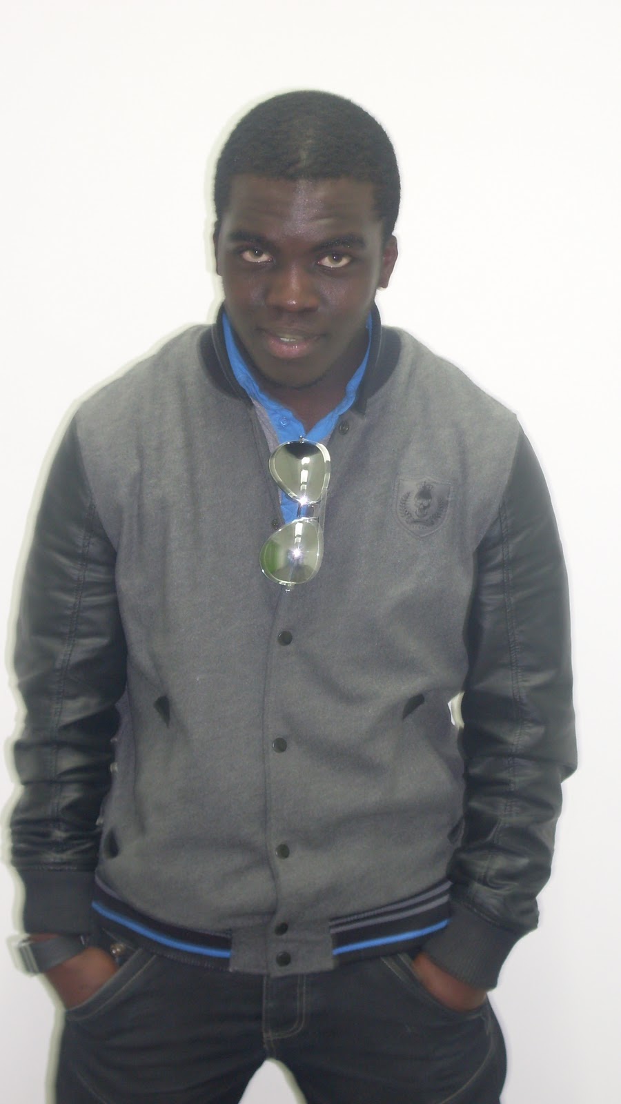
I have decided to use this image for the double page spread for a few reasons. Firstly, the fact that he is standing with his hands in his pockets, matches the attitude of the person I am trying to replicate. Secondly, the fact that he took up all of the camera shot makes him look much larger on the page.

I decided against using this image because of the fact that it is far too white. I think that the brightness on here wouldn't help it stand out on the page, which is something that my target audience stated they wanted.

I have decided not to use this image on the double page spread. This was because of the fact that the face that he pulled when the picture isn't wanted I was looking for.

I have decided not to use this image for the double page spread. This was because when the image was taken, he was moving his body which created the blur. Because of this, it wouldn't have been as clear to see, on the page.

I have decided not to use this image on the double page spread. This was because of the fact that the face that he pulled when the picture isn't wanted I was looking for.
I did not use this image because I thought that it was quite scary to go on the page. This was because the way that he has is face downwards with his eyes looking up is quite off putting. So, if I was to find it like that, then the public would also likely see it like that.

I contemplated having this image on the double page spread, but I though that the quality of the picture, made it look quite grainy around his head. So if it was to appear in my magazine, I would want it to be as clear and of as good a quality it can possibly be.
I have decided to use the image from the front cover of the magazine in the double page spread. There are two reasons for this. Firstly is that it creates a link between the double page spread and the front cover, and secondly I think that the picture used, is of better quality then the other images that I took from this photo shoot.
No comments:
Post a Comment