Photo Shoot
These are all of the photos that I have taken for the front cover of my magazine. I am going to comment on them to show which one I have chosen to go on the cover and why.


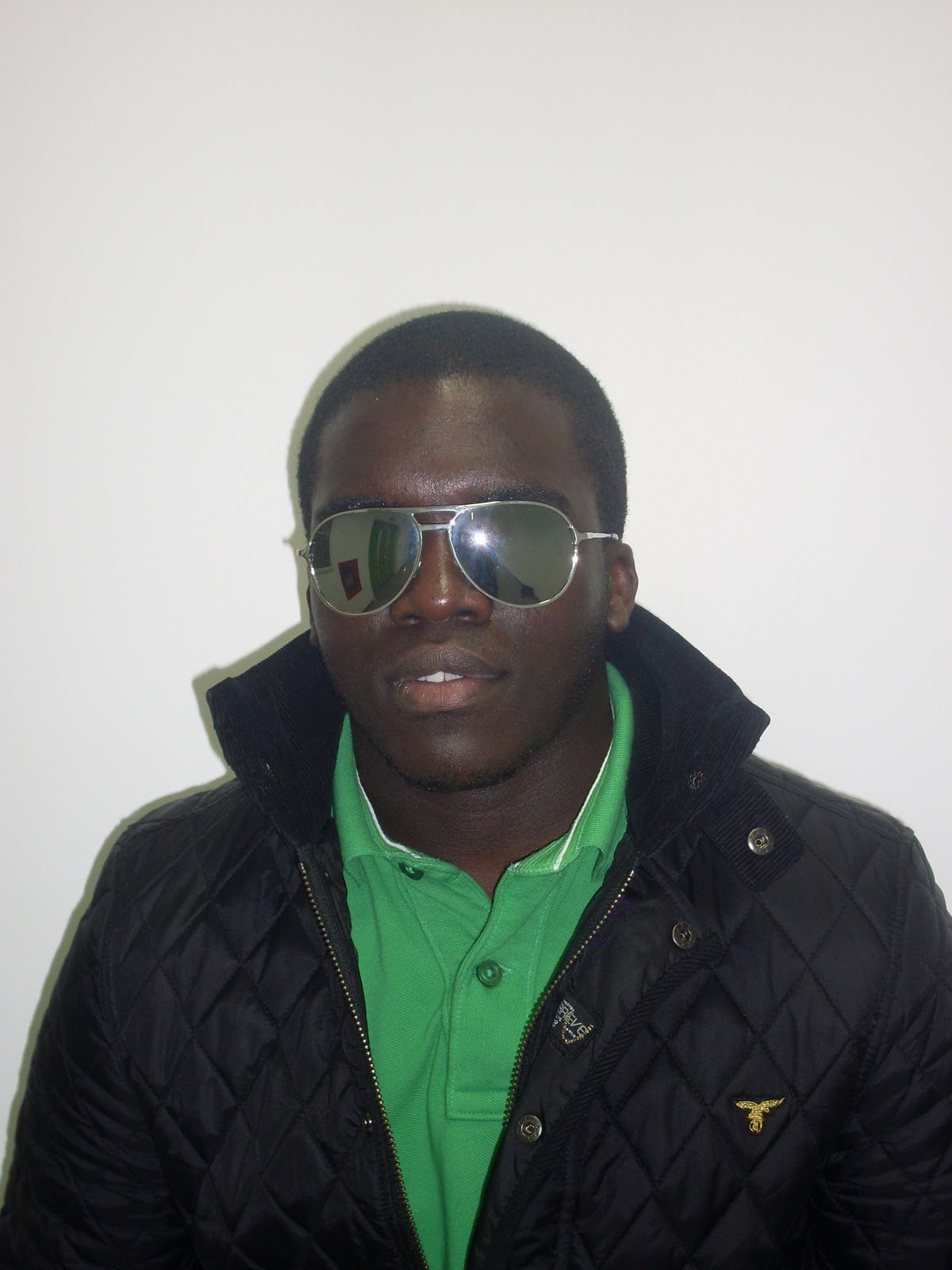
I decided against using this image as my main image on the front cover because I didn't like the look that the character had. I though that the position of the mouth looked like it was in mid movement and it made the image look worse. I did like the way that the glasses sat on his face, but I think that the mouth over powered this.

I chose not to use this image for my front cover for a few reasons. Firstly, I didn't like the way that the character looked like he was slightly slouched. I think that if he was going to be on the cover, he should stand upright to make him look powerful and look like the stereotypical man. I also didn't like the fact that he has his lips pouted. I think that this looks stupid and I don't want it on my cover.

I did like the image for the front cove and did consider it. This was because of the way that he is positioned facing slightly to the side with his eyes on the camera. I thought that this made it look it look powerful. The only problem with it was the colour scheme that was used on the cover lines. This was because of the fact that the green didn't go well with the blue and the pink.

I chose not to use this image because I thought that there was too much space on the image that did not have the character in it. Because of this, I thought that it would be pointless having it go on a front cover where the image is meant to take up the majority of it.

This is the photo that I had originally chosen to go on the front cover. This was because I liked the stance that the character was standing in, and he reflected the real life attitude and look that I was trying to get. However, when it came to applying this to the front cover. This image didn't look to good because the green colour from the shirt didn't look good with the blue and pink cover lines that were on the page. Also, the cover lines didn't stand out too good because of the black coat that he was wearing.

This image is far too dark to go onto the from cover of the magazine. This is because the flash wasn't on when I took the photo, and it made it come put in a darker colour. Because of this, it can't be chosen for the front cover as it wouldn't stand out on the page and help sell the magazine.

This image I chose to do the cover second. This was because I thought that the link between the cover lines and the colour of the top would be quite good and it would create a link between the image and the cover lines, which would appeal to the target audience. Not only this, but I think that it looks good and matches the type of image that I wanted. However, when it came to putting the image onto the cover, it didn't look that good as it was difficult to find a position that would allow his hand, head and the cover lines to be seen clearly.

I can't use this image even if I wanted to for the front cover. This is because the image was taken when he was moving which has made the image blurred. Because of this, I can't use this image.

I have chosen not to use this image as the one for my front cover. This is because of the fact that I don't like the way that his head is facing. I think that it should be positioned in a direct mode of address with his face looking directly at the camera. I also don't like the way that his lips are positioned as it looks like he is in mid conversation.

This was the image that I actually chose to go onto the front cover. This is because of the fact that I thought that he looks exactly how I wanted him to look. The positioning of his hand makes him look like he has his own swagger which is needed for a RnB artist. When I put this on the page, the image fitted perfectly with his hand being placed above the cover line that runs across the bottom of the page, and the head tilt to the left allows it to fit in between the cover lines at the top. The colour of the shirt that is hidden underneath the coat is reflected in the colours used for the cover lines which allows the creation of a colour scheme which I think is a nice touch to the front cover.

I decided against using this image as the front cover because I felt that it looked too posey. This is because the fact that his hands are on the his coat and pulling it forward make it look more like a fashion photo rather than a photo from a magazine. I also wasn't full on seeing his face pointing straight towards the camera as I think this further proves that it is quite posey.

I also decided against the use of this image for the same reason as was stated above. Because of the fact that he has his hands on his coat and doing it up makes it look it is a fashion photo. I also didn't like the positioning on his body as it is arched to the side. I thought that this didn't look very good as it made it him look slightly more feminine than it should, and as he was promoting a masculine figure in the RnB music industry, I thought that this wouldn't have been appropriate. I also didn't like the fact the image has teeth coming out of the smile. I thought that this didn't look good because generally males don't smile showing there teeth when they are trying to look powerful.

This is the final image that I took that I wanted to go no the front cover. I didn't want to use this image because I thought that it looked to boring to go on the front cover. This is because there is no personality or attitude that can be taken from the image as he is standing there with a blank expression. Another factor that made me decide that this image wasn't going to go on the front cover, was the fact that it is slightly blurred over the face. I didn't want to have this because of the fact that if it is blurred, it would be hard for the people to distinguish who it was because of the poor quality.
Daniel - your photo shoot rounds off an exemplary section on Research and Planning. You have done everything in a huge amount of detail and are actually so organised that you are running ahead of internal deadlines. Your drafting is excellent, as are all aspects of your research. I have no doubt that this is a level 4 response and expect to award between 18 and 20 out of a possible 20 marks.
ReplyDelete