Monday 28 March 2011

Final Pieces

Final Cover


Final Contents


Final Double Page Spread

Monday 21 March 2011

Music magazine double-page article audience feedback

Target Audience Feedback

Here I am going to see what my target audience think about my Double Page Spread.

Oliver Warden
Firstly, I think that the colour scheme shows that the writing will be noticed by both sexes and the pink and blue writing both serve different purposes. I think that the large font passages of text draw attention well to a main apart of the story.  
However, You haven't outlined what the article actually is. In the image you can see the photographer again which isn't very good. The grey effect is quite distracting to the reader because the writing doesn't stand out as much and it plays with your eyes.

Dean Ramsay
With regard to the positives, the colour scheme has been carried throughout the magazine. I do like the grey lines that come from the top corners of the page because it makes it look professional.
But on the other hand, You have used the same image on the front cover in the double page spread. I think this is a bad thing to do. You haven't shown whether it is an interview. It isn't very obvious.

David Brogden
Firstly I am going to start with the negatives. I have noticed that there is no real heading on the page so you don't know what the section is really about unless you are familiar with who the artist is.
On the contrary, the pictures have been edited well from having all of the backgrounds taken out. The colour scheme is quite basic so it means that it can be easily seen on the page as it is readable. The images that are used are centred and means that it is clear to see that both pages are to do with the same artist.

Helen Martin
I like the colour scheme, I like the contrast between the blues and pinks and the back writing at the top, I think by having such a harsh colour with the softer ones it makes it stand out more.  I like the way the writing is easy to read, I also think the background makes the page more sophisticated and adds a bit of edge to the page.
However, although I like the pinks and blue colours used, I think they area  bit too feminine as they are softer colours, I'm worried they will attract more of a female audience rather than having a good balance as male readers might not want to read the article.
I also don't like the fact that there is no heading, its hard for the reader to understand what this page is about, until they read it.

Music magazine contents page audience feedback

Target Audience Feedback


Oliver Warden
Firstly I am going to start with the positives. The alternation between the colours that is used in the column helps attract the audiences eyes because it is attractive and helps it stand out. The numbers being a different colour also contrasts off the page and helps it stand out which helps the audience take in the relevant information. The effect that is used on the top and bottom of the page adds a unique feature and creates a sense of style to the page.

However with regard to the negatives, the images have background in them and are square images. This doesn't look very attractive on the page and makes it look unprofessional. The pink shadow on the words contents looks a bit out of place on the page, if you had used black, it would have matched with the other shadow effect used on the text and made it look better.

Rachel Turnbull
The positive points on the contents page are that the colour scheme that was used on the front cover runs through this page which is a good feature to the page. The photos look a lot more professional and are placed well over the page. The texts more spread out and makes it look a bit more eye catching and doesn't put the reader off looking at it.

However, I don't like the the first column because it is quite bunched and hard to read. The text is very busy and in your face.

Dean Ramsay
Firstly, I think that the colour scheme is good because it carries on from the front cover to the contents page. The images also look quite professional. I find the
overall design of it looks appealing to the eye.
However, I think that the column down the left hand side of the page is a bit to small. I think that if it was bigger it would be better.

Victoria Carruthers
I think that the use of the colours blue and pink suggest that it appeals to both sexes of the target audience which I think is quite a good technique to use.
However, I have noticed that the numbers on the page aren't in chronological, which I think it should be in. The font that is used, looks quite immature.

Jai Chahal
I really like the background of the page, I think that it fits in with the style of the magazine. I also like how there are three pictures which are from the main headlines.
On the other hand, there is quite a lot of writing on the page which hurts my eyes slightly when I look at it. I think that there is too much pink and blue used on the page. I think an alternative colour should have been used.

Music magazine cover audience feedback

Target Audience Feedback


Here I am going to ask members of my target audience to see what they think about the front cover of my magazine. Here I will be able to judge if what I have created is what the people wanted.


Oliver Warden
The positive aspects of the front cover that has been created are the colour scheme used, the background colour and the man image. Firstly, the colour scheme that has been used include specific colours which link up with the image colours. The pink and blue contrast each other and it catches the attention of the reader which brings attention to both sets of writing. Also, the shadow effect behind the pink and blue colours used, make the writing stand out. Secondly, the background colour is good. It's not too eccentric and therefore doesn't steal the thunder from any other features on the page. It helps everything stand out off the page, so it does its job well. With regard to the main image, the pose of the image is the right sort for the image for the magazine. It is quite cool but with attitude which is generally associated with hip hop and current celebrities in the modern day. Because the image is over the name of the magazine and the sell line, it suggests that the magazine is a high end magazine and doesn't need to promote it self and would rather promote the image than the magazine because it is that which is going to sell it.
However, there are some negative things that come from this front cover. These include the use of the shadow effect and the main image. The writing which goes over the image can be misconceived because the little black line can play with your eye a bit. With regard to the main image, you can see the photographer in the glasses which makes it look very unprofessional and reduces the overall quality of the page. Also, the use of the image over the magazine name and sell line means that the magazine isn't being promoted which is obviously a bag thing. 

Rachel Turnbull
I think that the positive thing to come out of the magazine is the colour scheme that is used. This is because of the fact that it provides a link to the main image which makes it look professional.
However, there are some negative things from the magazine.  Firstly you can see the photographer in the glasses of the main image which makes the front cover look less professional. Also, you cant see the text over that is underneath the main image which distracts the readers attention over the mast head.

Dean Ramsey
I think that the front cover of the magazine does look professional. I also think that it is a good colour scheme because they stand out off the page and are easy to read.
However, I don't like the fact that you can see the photographer in the main image. I think that is doesn't look very good. Also, the fact that you cant see the sell line on the page at all because it is covered by the main image. This is the same for the mast head as well.

Callie Bilverstone
For the positives, I like the way that the title is slightly hidden behind the main image, because it makes the image look likes it's coming out of the page. I also like the colour scheme used because it is clear to read and it is obvious what is the main cover lines.
However, I think that the negative thing that comes form the cover are that the main image could have been taken at a different angle because you can see where the picture was taken in the sunglasses.

Music Magazine Double Page Spread Production

Double Page Spread Production


This is the production stage of the double page spread. Here I am going to talk about how I have made it.


This is the first production stage of the double page spread. Here you can see that I have created a line down the centre of the page. This is so that it can be distinguished as a dividing line between the page. I have decided to include the mixture of the two grey colours to allow it to stand out off the page, and the white writing over the top of it, allows it to be even clearer. I think that this allows the audience to be aware of what the pages will include when they flick through them. When I asked my target audience what they thought, they thought that it was a good idea.  


This is the second production stage of the double page spread. Here you can see that I have started typing out the first paragraph to the article using a black font. It uses the same font that has been used throughout the magazine which shows that a house style is being created. This means that the readers will see a format that they recognise which will make them feel more comfortable when reading it.  


On this production stage it shows that I have changed the size of the font. I have decided to do this to the opening paragraph because when I have done my research, I had found that this effect was used on it. So because of this, I have used it in my magazine as it is a successful technique in allowing it to stand out.


On this production stage, I have started to write up the article. I am aware that the colour scheme that is used doesn't allow the audience to see the questions and the answers that will be used. But I am going to change it later on in the production stage.


Here I have included more of the article. I have also put in it a large passage of text. When I looked through my research I became aware that this technique has been used in a lot of magazines. So, when I consulted my target audience about including this in my article, they thought it would be a good idea. I have left the space at the top right corner of the page on the left because I am going to place an image on it.


On this production stage, you can see the article is starting to take shape. I think that it is starting to look quite good. The reason why the column of the text is halfway down the page is because there is going to be an image placed above it.


This production stage shows the end of the article. Here you can see that it takes up the vast majority of the page, which is generally what happens. I have decided to use another large passage of text to help break the text up slightly. I think that this helps make the article look more real.


On this production stage I have included the images which shows the near completion of the magazine. All of the content that it is going to be in the magazine is placed on this page. I am contemplating moving some of the text around to see what it looks like.


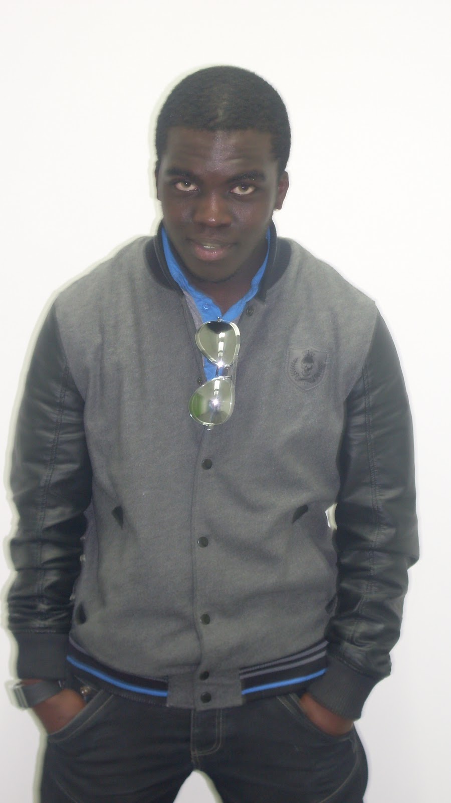
Here I have changed the colours of the text. This brightens the page up massively which definitely improves the overall quality of it. I have used the grey for the first paragraph because I have taken it from the colour of the coat the man is wearing. It also works well with the grey colours that are used in the colour of the page. I think that this link is a good one to use because it makes it look better. I have used the same colours from the contents page and the front cover because it allows a house style to be created.


On this production page I have tried to see what the page would look like if it was to have the background that is used on the contents and cover on it. I don't think that it should be used on this page, because although it is creating a house style, I don't think that you can see the colours of the text that well on it.


This is what the final double page spread looks like. I have included the lines going through it because they have been done on the contents page. As you saw before, when I tried to include the grey and white background, it didn't look as good as it does now. I think that this looks quite professional and I think  that it fits its purpose of informing the reader.


This was something that I tried when I had finished with all of the production stages. I was curious to know whether my target audience thought that it looked better the way it was before, or with the light grey coming from the grey that is used in the top left corner. When I asked their opinion, we both agreed that it look better the way it was beforehand.


This is the final stage of the production stage. Here I have taken into consideration what my target audience have highlighted and made some additions to comply with this. I have added across the bottom of the page the page numbers that I didn't include. I was against including them in but now that they have been inserted, I think that it looks quite good. I have also included the website for the magazine and the name of the magazine. The name of the magazine has been written in the same style as the name on the front cover. I think that this is good because it allows the audience make a link from the cover and the DPS. It also acts as a gentle reminder to the audience that this DPS is part of the magazine. I have also change the size of the Kanye that is positioned in the top left corner. I think that it looks like it is more like a headline to the DPS compared to what it did previously.

Monday 14 March 2011

Music magazine contents page production

Contents Page Production

This is the production process that I went through when I was creating my contents page.


This is the start of the production for my contents page. I have decided to use the same colours that were used on the front cover cover lines for each headline on this page. This is because I think that it allows a house style to emerge in the magazine. This was also highlighted in the research that I did with my target audience. I have also decided to make the colours of the numbers on the page black as they stand out against the background which allows it to be seen clearly.


I have decided to include the top twenty songs in the music chart because I think that it is quite a unique feature to include. I think that this is starting to take some shape which I think looks good. I have decided to move the heads lines that are on the right hand side of the page upwards because I think that it adds a bit of character to the page instead of it being regimental. It also means that I have options on the page to include images.


I have decided to get rid of the name of the magazine at the top of the page. This is because I think that the name of the magazine isn't needed on the inside page if front cover as it wastes space that could be used. When I consulted my target audience about this, they agreed with what I was saying. I also have used the same effect on the writing that I used on the front cover. This I feel, adds to the creation of a house style.


Here I have included the images that I want to have on the page. I have decided to have different orientations for the images because I think that it improves the layout of the page. I asked members of my target audience if the preferred different orientations or similar and they stated that they thought different, was the correct way to go. I have also put the numbers of the page that the images are linked to over the top of the image. This is because it allows space to be saved, and allows them to stand out against them. This is down to the fact that the white contrasts with the colours on the image.


Here I have inserted the background of the contents page. The same colours have been used on this page that were included in on the cover. This allows the creation of the house style to be complete as all of the colours used on the cover have been incorporated on this page.


The white lines I have been included to add something to the page. I think that it makes the page look more professional because it seems to be broken up more and helps everything on the page to seem lifted on it, as it adds another level to it. 


Here I have changed what goes down the left hand side of the page. When I asked my target audience about the previous image, they stated that they thought that the text was too small. So I decided that it would be an idea to scrap the idea of 20 and put 10. I then increased the size of the font by 1 to see if that was clearer. I then re- my target audience and they thought that it was clearer. However, there was a large gap underneath so I decided to fill it with the Album top 10. I think that this looked a lot clearer on the page than it originally did so these changes were worthwhile.


On this production stage I decided to change the layout slightly. I thought that by splitting up the stories into categories would be make it look more presentable. I put the names of the sections in black so that it would stand out, and I also used the double lines to help break the page up. I then moved the stories into the corresponding sections.  


This is the final stage in the production stage so this means that this is my actual contents page. Here I have done a few more changes to the page. I thought that the page needed to be changed because it looked pretty much the same as it already did. I decided to rearrange the page so that the singles chart was across the bottom of the page. I thought that this would make it original and I think that it looks good. I also made sure that the images were slightly larger than they were before as I thought that they didn't really do anything for the page. So with this I decided that the numbers on top of the images needed to be increased as well. I then rearranged the page the stories so that they covered the centre of the page. I added a new story into it to fill in a gap and I think that it looks quite good.

Music magazine cover production

Cover Production

Here I am going to go through the process of how I created the cover.


This is the start of the front cover production. Here you can see that I have created the title and the cover lines that I want to include on the page. I have decided to have the name of the mast head as the largest thing on the page because I think that it shoudl stand out the most. The colours of the title and the cover lines match with what my target audience wanted. I have tried to put the top and bottom cover lines as grey because I want to see what it looks like.


This is the second production stage that I have got up to. I have decided to change the colour of the blue to a more lighter blue. I have decided to do this because I thought that it looked too blue and I think that when you look at this colour, it complements the pink more. I also asked members of my target audience what they thought and they agreed with me that this blue looked better on the page. I also consulted my target audience about the top and bottom cover lines. We both agreed that it would look better if the incoporated the colour scheme that I have decided to use instead of using a grey colour. I think makes it look better. 


In this production stage, I have placed a backdrop on all of the text that is on the page. This was done by copying the text and placing it slightly hanging over the bak of it. This has made it stand out of the page more allowing to be easily read.


This is the background that I have put on the page. I think that this allows the text to stand out more on the page because the grey colour isn't too overpowering or too soft. This coupled, with the change of the text on the previous production stage, allow it to stand out.

On this production stage I have added into the image. I have decided to have the image as the largest thing on the page, because after my target audience research, they stated they wanted to have the iamge as the largest thing on the page. It takes up the entire page and goes slightly over the name of the magazine which I think is a good technique to use as it adds to it another level.


This is final production stage of making the magazine, leaving only the finished product. Here you can see that I have inserted the image and placed it over the sell line and the mast head. When I did my research, I realised that some of the magazines have the main image going over them, so I thought it would look good if I replicated this. I also placed a cover line to the right of the image in a larger font. This has helped show off  the image and large cover line as it has something to do with the main article.

Music Magazine Double Page Spread Photo Shoot

Double Page Spread Photo Shoot

This is the photo shoot that I took for my double page spread. Here I am going to show which ones I liked and why I chose to include them.


This was the first image that I took for the double page spread. I decided not to use this image because it was took whilst he was moving his hand. I thought that with his hand being positioned over his face made it more difficult for people to see. Also, I think that the hand over his face makes he seem scared and inferior and this contradicted the stereotypical masculine ideal that I was looking for.  


I  contemplated having this image on the double page spread because of the fact that I like the way that he is standing as it looks very masculine and authoritative. But, when I put it on the page it looked too dark so I have decided to not include it.

I have decided to use this image for the double page spread for a few reasons. Firstly, the fact that he is standing with his hands in his pockets, matches the attitude of the person I am trying to replicate. Secondly, the fact that he took up all of the camera shot makes him look much larger on the page.  


I decided against using this image because of the fact that it is far too white. I think that the brightness on here wouldn't help it stand out on the page, which is something that my target audience stated they wanted. 


I have decided not to use this image on the double page spread. This was because of the fact that the face that he pulled when the picture isn't wanted I was looking for.


I have decided not to use this image for the double page spread. This was because when the image was taken, he was moving his body which created the blur. Because of this, it wouldn't have been as clear to see, on the page.


I have decided not to use this image on the double page spread. This was because of the fact that the face that he pulled when the picture isn't wanted I was looking for.


I did not use this image because I thought that it was quite scary to go on the page. This was because the way that he has is face downwards with his eyes looking up is quite off putting. So, if I was to find it like that, then the public would also likely see it like that.


I contemplated having this image on the double page spread, but I though that the quality of the picture, made it look quite grainy around his head. So if it was to appear in my magazine, I would want it to be as clear and of as good a quality it can possibly be.


I have decided to use the image from the front cover of the magazine in the double page spread. There are two reasons for this. Firstly is that it creates a link between the double page spread and the front cover, and secondly I think that the picture used, is of better quality then the other images that I took from this photo shoot.

Friday 11 March 2011

Music Magazine Contents Page Photo Shoot


Contents Photo Shoot


This image I chose to put onto my contents page. This was because the student who I chose to take the picture of, looked similar to the music artist that I was trying to replicate. I took one image of this student and decided that this would be the one that I wanted to include. The way that he looks directly into the camera shows off a lot of power, as no matter where you look around the screen, it will always look as if he is
looking at you.  


This was the first image that I took for a female music artist. I thought that it looked to dark to go on the page as I thought that it wouldn't stand out as much on the page if it was darker than usual.  


This image this the same as the one before. I liked the image before and decided to put this into my contents page. I went onto fireworks and made the image brighter which has helped it look like a real photo. However, when I thought about it more, I realised that she didn't show any of the characteristics that I was trying to look for. I thought that the pout that she was trying to do, didn't look very good as I was hoping.  


This is the image that I decided to place on the page instead of the one beforehand. I thought that this looked more like the photo that I was after. This was because I thought that with her hands one her hair making it seem bigger made her stand out more on the photo and she takes up the most of it, and the fact that he eyes are fixated on the screen also intensifies this.


This was the first image that I took for the contents page. This man was trying to represent Eminem and I thought that by having his hoody on with the hood up, and a beanie hat on, I thought this showed a good representation of him, as he does where this kind of outfit. However, when I took this image, I thought that he looked too small on the screen, which I think makes him look weak.


This is a similar image to the above one. I have decided to do this again because I thought the outfit that he wore is the same that the style of Eminem. I liked the way that the photo has him placed centrally with him taken up more of the room, which makes him look more powerful.

Thursday 10 March 2011

Music Magazine Cover Photo Shoot

Photo Shoot

These are all of the photos that I have taken for the front cover of my magazine. I am going to comment on them to show which one I have chosen to go on the cover and why.


I decided against using this image as my main image on the front cover because I didn't like the look that the character had. I though that the position of the mouth looked like it was in mid movement and it made the image look worse. I did like the way that the glasses sat on his face, but I think that the mouth over powered this.


I chose not to use this image for my front cover for a few reasons. Firstly, I didn't like the way that the character looked like he was slightly slouched. I think that if he was going to be on the cover, he should stand upright to make him look powerful and look like the stereotypical man. I also didn't like the fact that he has his lips pouted. I think that this looks stupid and I don't want it on my cover.


I did like the image for the front cove and did consider it. This was because of the way that he is positioned facing slightly to the side with his eyes on the camera. I thought that this made it look it look powerful. The only problem with it was the colour scheme that was used on the cover lines. This was because of the fact that the green didn't go well with the blue and the pink.


I chose not to use this image because I thought that there was too much space on the image that did not have the character in it. Because of this, I thought that it would be pointless having it go on a front cover where the image is meant to take up the majority of it.


This is the photo that I had originally chosen to go on the front cover. This was because I liked the stance that the character was standing in, and he reflected the real life attitude and look that I was trying to get. However, when it came to applying this to the front cover. This image didn't look to good because the green colour from the shirt didn't look good with the blue and pink cover lines that were on the page. Also, the cover lines didn't stand out too good because of the black coat that he was wearing.


This image is far too dark to go onto the from cover of the magazine. This is because the flash wasn't on when I took the photo, and it made it come put in a darker colour. Because of this, it can't be chosen for the front cover as it wouldn't stand out on the page and help sell the magazine.  


This image I chose to do the cover second. This was because I thought that the link between the cover lines and the colour of the top would be quite good and it would create a link between the image and the cover lines, which would appeal to the target audience. Not only this, but I think that it looks good and matches the type of image that I wanted. However, when it came to putting the image onto the cover, it didn't look that good as it was difficult to find a position that would allow his hand, head and the cover lines to be seen clearly.


I can't use this image even if I wanted to for the front cover. This is because the image was taken when he was moving which has made the image blurred. Because of this, I can't use this image.


I have chosen not to use this image as the one for my front cover. This is because of the fact that I don't like the way that his head is facing. I think that it should be positioned in a direct mode of address with his face looking directly at the camera. I also don't like the way that his lips are positioned as it looks like he is in mid conversation.


This was the image that I actually chose to go onto the front cover. This is because of the fact that I thought that he looks exactly how I wanted him to look. The positioning of his hand makes him look like he has his own swagger which is needed for a RnB artist. When I put this on the page, the image fitted perfectly with his hand being placed above the cover line that runs across the bottom of the page, and the head tilt to the left allows it to fit in between the cover lines at the top. The colour of the shirt that is hidden underneath the coat is reflected in the colours used for the cover lines which allows the creation of a colour scheme which I think is a nice touch to the front cover. 

I decided against using this image as the front cover because I felt that it looked too posey. This is because the fact that his hands are on the his coat and pulling it forward make it look more like a fashion photo rather than a photo from a magazine. I also wasn't full on seeing his face pointing straight towards the camera as I think this further proves that it is quite posey.


I also decided against the use of this image for the same reason as was stated above. Because of the fact that he has his hands on his coat and doing it up makes it look it is a fashion photo. I also didn't like the positioning on his body as it is arched to the side. I thought that this didn't look very good as it made it him look slightly more feminine than it should, and as he was promoting a masculine figure in the RnB music industry, I thought that this wouldn't have been appropriate. I also didn't like the fact the image has teeth coming out of the smile. I thought that this didn't look good because generally males don't smile showing there teeth when they are trying to look powerful.


This is the final image that I took that I wanted to go no the front cover. I didn't want to use this image because I thought that it looked to boring to go on the front cover. This is because there is no personality or attitude that can be taken from the image as he is standing there with a blank expression. Another factor that made me decide that this image wasn't going to go on the front cover, was the fact that it is slightly blurred over the face. I didn't want to have this because of the fact that if it is blurred, it would be hard for the people to distinguish who it was because of the poor quality.