Monday, 14 March 2011

Music magazine cover production

Cover Production

Here I am going to go through the process of how I created the cover.


This is the start of the front cover production. Here you can see that I have created the title and the cover lines that I want to include on the page. I have decided to have the name of the mast head as the largest thing on the page because I think that it shoudl stand out the most. The colours of the title and the cover lines match with what my target audience wanted. I have tried to put the top and bottom cover lines as grey because I want to see what it looks like.


This is the second production stage that I have got up to. I have decided to change the colour of the blue to a more lighter blue. I have decided to do this because I thought that it looked too blue and I think that when you look at this colour, it complements the pink more. I also asked members of my target audience what they thought and they agreed with me that this blue looked better on the page. I also consulted my target audience about the top and bottom cover lines. We both agreed that it would look better if the incoporated the colour scheme that I have decided to use instead of using a grey colour. I think makes it look better. 


In this production stage, I have placed a backdrop on all of the text that is on the page. This was done by copying the text and placing it slightly hanging over the bak of it. This has made it stand out of the page more allowing to be easily read.


This is the background that I have put on the page. I think that this allows the text to stand out more on the page because the grey colour isn't too overpowering or too soft. This coupled, with the change of the text on the previous production stage, allow it to stand out.

On this production stage I have added into the image. I have decided to have the image as the largest thing on the page, because after my target audience research, they stated they wanted to have the iamge as the largest thing on the page. It takes up the entire page and goes slightly over the name of the magazine which I think is a good technique to use as it adds to it another level.


This is final production stage of making the magazine, leaving only the finished product. Here you can see that I have inserted the image and placed it over the sell line and the mast head. When I did my research, I realised that some of the magazines have the main image going over them, so I thought it would look good if I replicated this. I also placed a cover line to the right of the image in a larger font. This has helped show off  the image and large cover line as it has something to do with the main article.

Music Magazine Double Page Spread Photo Shoot

Double Page Spread Photo Shoot

This is the photo shoot that I took for my double page spread. Here I am going to show which ones I liked and why I chose to include them.


This was the first image that I took for the double page spread. I decided not to use this image because it was took whilst he was moving his hand. I thought that with his hand being positioned over his face made it more difficult for people to see. Also, I think that the hand over his face makes he seem scared and inferior and this contradicted the stereotypical masculine ideal that I was looking for.  


I  contemplated having this image on the double page spread because of the fact that I like the way that he is standing as it looks very masculine and authoritative. But, when I put it on the page it looked too dark so I have decided to not include it.

I have decided to use this image for the double page spread for a few reasons. Firstly, the fact that he is standing with his hands in his pockets, matches the attitude of the person I am trying to replicate. Secondly, the fact that he took up all of the camera shot makes him look much larger on the page.  


I decided against using this image because of the fact that it is far too white. I think that the brightness on here wouldn't help it stand out on the page, which is something that my target audience stated they wanted. 


I have decided not to use this image on the double page spread. This was because of the fact that the face that he pulled when the picture isn't wanted I was looking for.


I have decided not to use this image for the double page spread. This was because when the image was taken, he was moving his body which created the blur. Because of this, it wouldn't have been as clear to see, on the page.


I have decided not to use this image on the double page spread. This was because of the fact that the face that he pulled when the picture isn't wanted I was looking for.


I did not use this image because I thought that it was quite scary to go on the page. This was because the way that he has is face downwards with his eyes looking up is quite off putting. So, if I was to find it like that, then the public would also likely see it like that.


I contemplated having this image on the double page spread, but I though that the quality of the picture, made it look quite grainy around his head. So if it was to appear in my magazine, I would want it to be as clear and of as good a quality it can possibly be.


I have decided to use the image from the front cover of the magazine in the double page spread. There are two reasons for this. Firstly is that it creates a link between the double page spread and the front cover, and secondly I think that the picture used, is of better quality then the other images that I took from this photo shoot.

Friday, 11 March 2011

Music Magazine Contents Page Photo Shoot


Contents Photo Shoot


This image I chose to put onto my contents page. This was because the student who I chose to take the picture of, looked similar to the music artist that I was trying to replicate. I took one image of this student and decided that this would be the one that I wanted to include. The way that he looks directly into the camera shows off a lot of power, as no matter where you look around the screen, it will always look as if he is
looking at you.  


This was the first image that I took for a female music artist. I thought that it looked to dark to go on the page as I thought that it wouldn't stand out as much on the page if it was darker than usual.  


This image this the same as the one before. I liked the image before and decided to put this into my contents page. I went onto fireworks and made the image brighter which has helped it look like a real photo. However, when I thought about it more, I realised that she didn't show any of the characteristics that I was trying to look for. I thought that the pout that she was trying to do, didn't look very good as I was hoping.  


This is the image that I decided to place on the page instead of the one beforehand. I thought that this looked more like the photo that I was after. This was because I thought that with her hands one her hair making it seem bigger made her stand out more on the photo and she takes up the most of it, and the fact that he eyes are fixated on the screen also intensifies this.


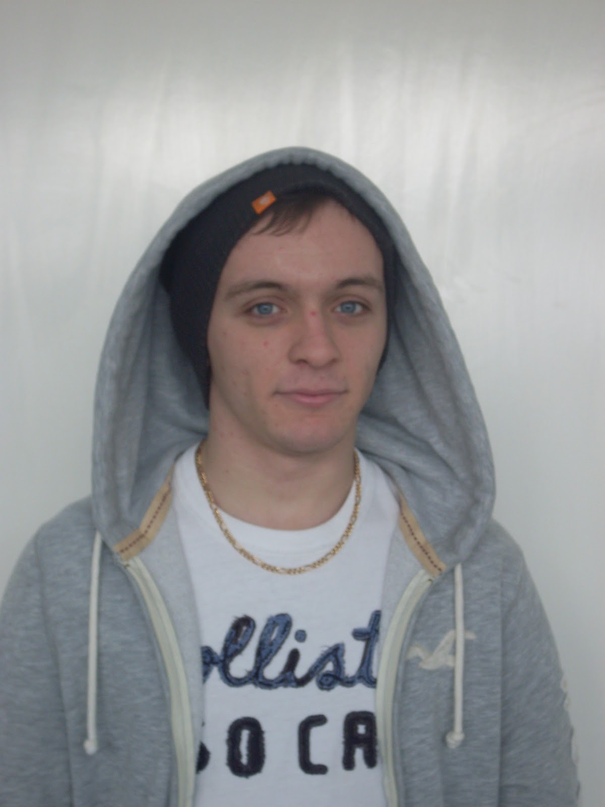
This was the first image that I took for the contents page. This man was trying to represent Eminem and I thought that by having his hoody on with the hood up, and a beanie hat on, I thought this showed a good representation of him, as he does where this kind of outfit. However, when I took this image, I thought that he looked too small on the screen, which I think makes him look weak.


This is a similar image to the above one. I have decided to do this again because I thought the outfit that he wore is the same that the style of Eminem. I liked the way that the photo has him placed centrally with him taken up more of the room, which makes him look more powerful.

Thursday, 10 March 2011

Music Magazine Cover Photo Shoot

Photo Shoot

These are all of the photos that I have taken for the front cover of my magazine. I am going to comment on them to show which one I have chosen to go on the cover and why.


I decided against using this image as my main image on the front cover because I didn't like the look that the character had. I though that the position of the mouth looked like it was in mid movement and it made the image look worse. I did like the way that the glasses sat on his face, but I think that the mouth over powered this.


I chose not to use this image for my front cover for a few reasons. Firstly, I didn't like the way that the character looked like he was slightly slouched. I think that if he was going to be on the cover, he should stand upright to make him look powerful and look like the stereotypical man. I also didn't like the fact that he has his lips pouted. I think that this looks stupid and I don't want it on my cover.


I did like the image for the front cove and did consider it. This was because of the way that he is positioned facing slightly to the side with his eyes on the camera. I thought that this made it look it look powerful. The only problem with it was the colour scheme that was used on the cover lines. This was because of the fact that the green didn't go well with the blue and the pink.


I chose not to use this image because I thought that there was too much space on the image that did not have the character in it. Because of this, I thought that it would be pointless having it go on a front cover where the image is meant to take up the majority of it.


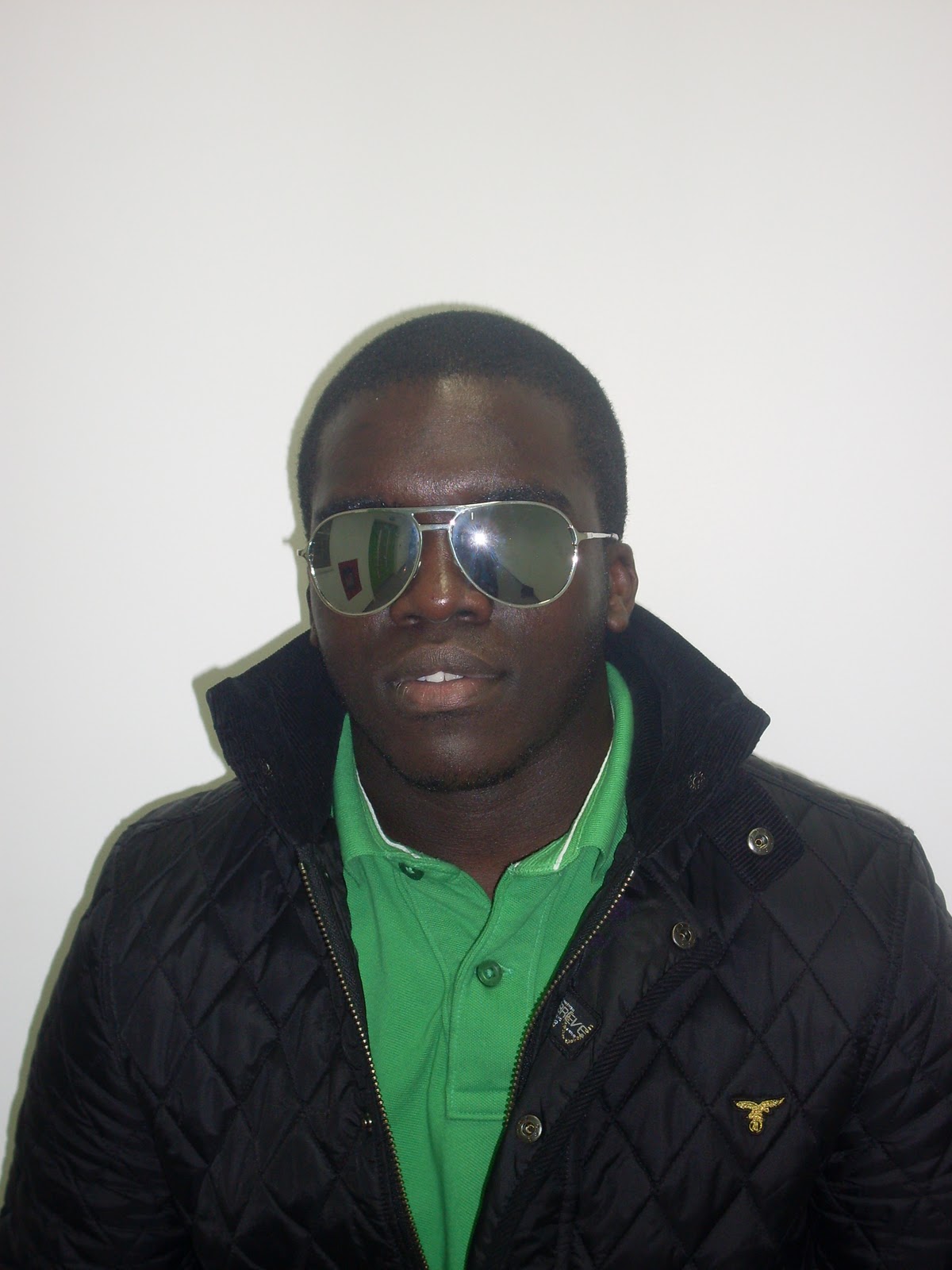
This is the photo that I had originally chosen to go on the front cover. This was because I liked the stance that the character was standing in, and he reflected the real life attitude and look that I was trying to get. However, when it came to applying this to the front cover. This image didn't look to good because the green colour from the shirt didn't look good with the blue and pink cover lines that were on the page. Also, the cover lines didn't stand out too good because of the black coat that he was wearing.


This image is far too dark to go onto the from cover of the magazine. This is because the flash wasn't on when I took the photo, and it made it come put in a darker colour. Because of this, it can't be chosen for the front cover as it wouldn't stand out on the page and help sell the magazine.  


This image I chose to do the cover second. This was because I thought that the link between the cover lines and the colour of the top would be quite good and it would create a link between the image and the cover lines, which would appeal to the target audience. Not only this, but I think that it looks good and matches the type of image that I wanted. However, when it came to putting the image onto the cover, it didn't look that good as it was difficult to find a position that would allow his hand, head and the cover lines to be seen clearly.


I can't use this image even if I wanted to for the front cover. This is because the image was taken when he was moving which has made the image blurred. Because of this, I can't use this image.


I have chosen not to use this image as the one for my front cover. This is because of the fact that I don't like the way that his head is facing. I think that it should be positioned in a direct mode of address with his face looking directly at the camera. I also don't like the way that his lips are positioned as it looks like he is in mid conversation.


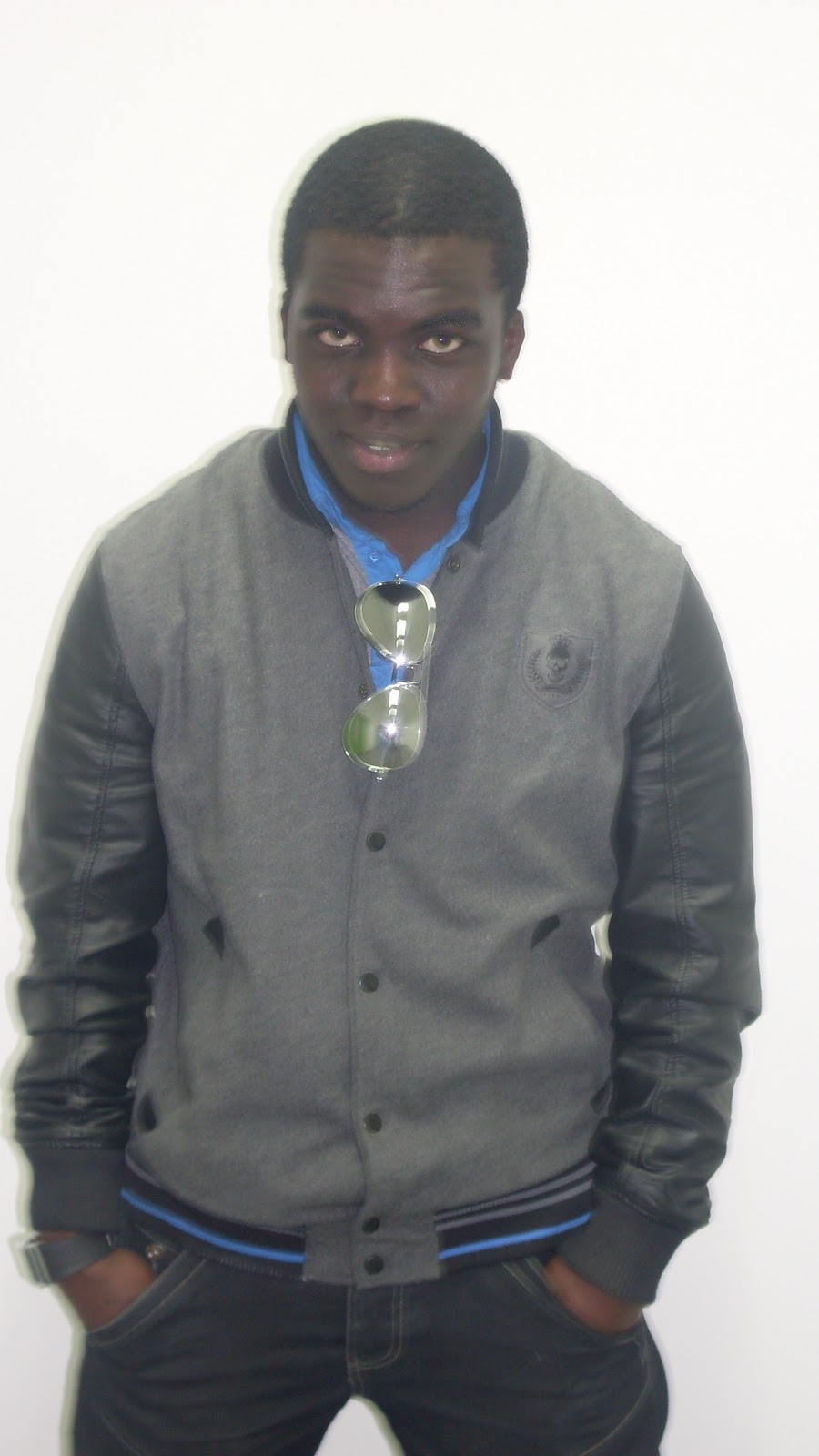
This was the image that I actually chose to go onto the front cover. This is because of the fact that I thought that he looks exactly how I wanted him to look. The positioning of his hand makes him look like he has his own swagger which is needed for a RnB artist. When I put this on the page, the image fitted perfectly with his hand being placed above the cover line that runs across the bottom of the page, and the head tilt to the left allows it to fit in between the cover lines at the top. The colour of the shirt that is hidden underneath the coat is reflected in the colours used for the cover lines which allows the creation of a colour scheme which I think is a nice touch to the front cover. 

I decided against using this image as the front cover because I felt that it looked too posey. This is because the fact that his hands are on the his coat and pulling it forward make it look more like a fashion photo rather than a photo from a magazine. I also wasn't full on seeing his face pointing straight towards the camera as I think this further proves that it is quite posey.


I also decided against the use of this image for the same reason as was stated above. Because of the fact that he has his hands on his coat and doing it up makes it look it is a fashion photo. I also didn't like the positioning on his body as it is arched to the side. I thought that this didn't look very good as it made it him look slightly more feminine than it should, and as he was promoting a masculine figure in the RnB music industry, I thought that this wouldn't have been appropriate. I also didn't like the fact the image has teeth coming out of the smile. I thought that this didn't look good because generally males don't smile showing there teeth when they are trying to look powerful.


This is the final image that I took that I wanted to go no the front cover. I didn't want to use this image because I thought that it looked to boring to go on the front cover. This is because there is no personality or attitude that can be taken from the image as he is standing there with a blank expression. Another factor that made me decide that this image wasn't going to go on the front cover, was the fact that it is slightly blurred over the face. I didn't want to have this because of the fact that if it is blurred, it would be hard for the people to distinguish who it was because of the poor quality.

Music Magazine Double Page Article Planning

Draft of Double Page Spread

This is my draft creation of my double page spread. I am going to comment on what I like about the 4 creations I have made and what I don't like about them. 


The first image that I am going to comment on is the one on the top left of the page. I have decided to place the title of page spread at the top of the page in the top left. This is because I think that it will give the audience an idea of who the story is going to be based on.
I have decided to place the images on the page in the centre. This is because from the research that I did, there was a large amount of people who said that they would want to see the images in the centre of the page. Coupled with this, is the fact that I think it would stand out more if it was surrounded by text to the sides and across the bottom.
The columns that I have used I think are good because it makes it look like a proper magazine, as they are used in a magazine. I think that it helps make the image stand out as it acts like a border to it.
However, a criticism of the draft is that looks quite boring in comparison to the others. This is because it has only the basic features on it, such as the column of texts and images, whereas the others have bold features and passages about the text. But an alternative view of this is that although it is boring, it makes the information on the page stand out more. I do actually like this one but it isn't my favourite of them all. The layout of the page is quite good as everything on the page will appear clear and concise, and will allow it to be easy to read.


The image on the right hand side of the page is of an alternative design to the one on the left. The layout of the page is slightly different to the page on the left, but I don't think it is as good as it. I don't like the way that the images go across the top of the page as I think that it doesn't look as good as being placed down the side. Also, the images would need to go across the page horizontally for the image not to distort.
The columns of text that have been placed on the page jack up the vast majority of the pages. This has been done so that there can be as much shown from the article as possible which would make the best use of the space. I have positioned them underneath the images so that it makes it look like they resemble the images. I have chosen to use columns because I think that it looks quite good, and helps break the text up a bit. Also, it makes it look like a real magazine spread, as columns are used there.
I have chosen to include the bold piece of text that comes from the article for two reasons. The first reason is that from my research that I did, I found that quite a lot of magazines had portions of text from the interview or story, included. The second reason is that from the questionnaire that I did, nearly all of the people questioned said that they would prefer to see it. So I have decided to include this feature. I have decided to place this on the left on the column which is furthest right. This is because I think that it looks quite good being on the inside of the page as opposed to the outside.
Overall, I don't really like this one. This is because I think that the other ones look better than it. I don't like the fact that the images are at the top of the pages, which I think is a big factor in it not looking as good.


The image on the bottom left is another alternative draft I could make my double page spread from. I have decided to include a title on this page because I think that it will make the audience aware of who is being featured on the page. I think that this is a good feature to include as well.
I have decided to include a passage of text underneath the title. I have chosen this because I think that it would help introduce those who are being interviewed. I quite like including this as a feature because it is used in some magazines, and I think it does its purpose effectively. However, I don't like the fact that it goes past the title and goes into the column of text that is next to it. I don't think this looks very good because it would be quite off putting by having two types of text mixed together, which people would also probably find difficult to read.
The inclusion of the column of texts that goes down the right of the left page and the right side of the right page, looks good with the column underneath the image. I decided to put this here because I thought that it would look continuous when people were looking at it. I also think that it looks like a real article in a magazine when you look at it.
The images have been positioned underneath the passage of text. I chose to place this here to give a small break on the page from the text above it. I have placed the image above the column of text to help break up the page. I think that the use of this is good because I think that helps improve the overall look of the spread. Also, I think that this complies with what my target audience wanted, as they said that they wanted the image to stand out, and by being surrounded by a lot of text, it surely does this.
Overall, I think that this draft is quite good. I like the overall layout of it and I think that there is a good mix of images and text. However, I don't like the way that the passage of text goes over he column of text. I think this makes it more difficult to see.


The final draft that I have created which could be my double page spread is in the bottom right corner. This has a title on it in the top left corner of the page. I think that this looks quite good because it allows the name of the people who are going to be included into the article to be visible clearly and stands out of the page more. 
I have included the passage of text underneath the title. I have chosen this because I think that it would help introduce those who are being interviewed. I quite like including this as a feature because it is used in some magazines, and I think it does its purpose effectively. I like the way that it falls directly underneath the title which will help it look more professional and improve the overall layout and overall quality of the magazine.
The bold piece of text that is used on the page will be taken from the actual article. I have decided to do this because I think that it would increase the overall presentation of the magazine. Also, the fact that the target audience have stated that they would like to see pieces of the article written in bold, has helped me include this. I think that this makes it look even better and look even more like a real article. 
The images that I have used have been placed down the centre of the page. I think that this makes it look better being placed down the middle of the page as it allows them to take centre stage on the pages. Also, with the fact that it is surrounded by everything on the page, it allows them to stand out even greater.
The columns that have been used go along the sides of the pages and across the bottom of them too. As was stated before, they allow the images to jump off the page. 
Overall this is the best of the drafts that I created. I really like the use of the passage of text, the use of the bold portions of text and the overall layout of it. I have decided that I am going to make this double page spread.  


Double Page Spread Mock Up


This is the style that I am going to follow when I make my double page spread. I think that this allows everything to be well laid out and it gives everything a clear structure and place. It means that all of the sections will stand out of the page and be clear to see which is a must have in an article. I think that this format makes it look like a real magazine.


Music Magazine Contents Page Planning

Draft of Contents page


This image is a draft of what my contents page will look like. This is quite a basic sketch of 4 styles that I could use. I am going to choose one of them and make it into my actual page. I am going to point out what I like and what I don't like on each one and see which one I clearly like more.


The image on the top left hand side of the page is the first draft I am going to analyse. The way that the title is positioned has been done so that it can be seen on the whole page as it positioned centrally across the page. 
The background I will make have a colour which allows it the text on the page to stand out. This needs to be done so that text can be easily read.
The columns that will be used on the page have been chosen because of the fact that this makes it look more like a magazine. By keeping it all in order and quite regimental, makes it look more professional and presentable.  
The images that have been done on the page have been placed underneath the some of the columns. This has been done so that the make the page look well laid out as if they were put on the side of the page, it would make it look more shabby. They will be the same width as the columns because as stated before, this will make it look less well laid out. The images will have the number of the page written on them in the bottom corner. This has been done because it allows there to be a theme running through it. I also think that it looks much better being inside the image rather than outside of it. 
The subject headings have been placed above the columns of text. This has been done because I want it to be clear to the readers where everything is. So for example, if they were looking for something on clothing, they would look up the subject Fashion.   
However I don't like the fact that there is so much space on the page. I think that the fact that this space could be used to put a larger image in or more stories.


The image on the top right of the page is an alternative design of the contents page. I have split the page into two pages. I have decided to do this because I think that having it on two pages allows there to be more information placed on it. On it, I have placed two titles on the pages. This has been done so that there is a sense of continuity developing over the pages which allows the readers to feel more relaxed when looking at the page as they aren't introduced to anything knew. I have chosen to position the titles of the pages in the centre as I think it makes it look clearer.
I have decided to place two images on both pages because it makes it audience see continuity between the pages. The reason that they have been placed on different positions on the page is so that whilst there is continuity on the page, they are still different to each other. The images will have numbers placed inside of them because I think that it looks better than them being outside of them. I will make sure that the colour of the text will allow it to stand out so that it is clear to see on the image, or otherwise it would be pointless to have it inside.
I have decided that the cover story should be separate from the other stories that will feature in the magazine. This is because it makes it look individual and stands out whilst it improves the overall presentation. I have included a little portion of text about the cover story so that it gives a brief description to the audience about the story. I have placed the page number half in and half out of the text so that there is a difference in colour between the two colours.
I have put all of the other stories in the magazine on the other page. This has been so that the main story is shown to be the clearest thing on the page, and the rest of the stories are of less importance than the main cover story. They will all be positioned directly underneath each other so that it makes the layout look better. I have decided to place the numbers on the right of the text. This is because I think that it looks more like a real magazine if it is on the right than if it was on the look. I also think that if it was placed on the left of the text, it wouldn't look as good overall.
I think that the fact that there is quite a lot on both pages is quite off putting. I think that this would look better if there was more space by getting rid of one or two of the stories that are on show.


The image on the bottom left of the page, is another draft of the contents page. It has the title placed across the whole of the top page. Although it is quite compact, I think that it is the best out of the ones that I have created. The title has been placed across the top of the page which makes it look like it is the clearest thing on the page, and with it stretched across the whole page, this further enforces this.
The images placed across the top of the page have been done so that the two images can be seen clearly. This has been done so that the images can be seen clearly without being crowded out of the page. It also helps show off what is still to come in the magazine without there being text to describe it. All three of the images will have the number of the page at the bottom of the page written in a colour which helps it stand out. The final image has been placed on the bottom right of the page. This has been done to help break up the the text that is on the page.
There is a border that has been used down the sides of the page. I have chosen to do this because I think that it will bring the page together, and it will allow the information that is inside the border to stand out more.
The stories that are on the page have been positioned down the left hand side and the right hand side. This has been done to make it into columns which is the stereotypical style that is used on magazines. This helps with the layout of the page as it makes everything more easier to see. All of the stories have the page numbers next to it. This has been done because it makes it clear to the audience where the stories in the magazine are. The cover story has been placed at the top of the list because it is the main story that is going to sell the magazine. So by making this first, it allows there to be a link between the most prominent thing on the front cover and the first thing that they see on the contents page.


The draft on the bottom right hand side of the page is the final alternative to my contents page that I have created. I have tried to use a continuing style on the page, with the titles coming off from the border and acting like a flag. This has been done so that they stand out of the page as they are something different in comparison to the rest of the page.
The cover story remains separate to the rest of the stories and has been written so that it fits into the same style as the titles. Although it follows the same format, the direction that it comes out of the border is different to the titles. This has been done so that whilst following the format, it remains different to it.
The idea for a pattern has been used so that it can allow the tabs to come out of them. These will all be of the same colour so that it there is a colour scheme being created. 
I have chosen to have the images placed at the bottom of the page because I think that it was a choice between the images or the text being placed in the centre of the page. I think that the images being placed along the bottom allows all of the important information to appear in the centre which is the most eye catching part of the page. The images will have the page numbers inside of them so that the audience can make a quick reference to them. They will be written in a colour which is easy to see on the image, or otherwise this would be pointless to incorporate.
Finally, the stories that are on the page have been placed underneath the main story because they are of a lesser importance. They have been written directly underneath each other so that they look like one large column which is normally used in a magazine. Therefore I think it would be a good idea to use it so that it follows the normal style of a contents page. The numbers for the page have been written on the right hand side of the page. Think that these look better placed there than on the left hand side. 
However on a negative note, the page does look quite basic and simplistic which isn't very good. I think that if it was more unique and had a good style included into it, it would look much better.


Mock of Contents Page


This is my mock up of the contents page. This will what my contents will look like if I was to follow the template that I created. The only difference would be the images because I would have to take these by myself. However, I am not sure whether I like the look of it. This is because I think that it doesn't look like a real one the way that it looks like there. I don't think that the borders look very good because I think that they make it look cheap. I do like the positioning of the images because I think that it makes it look quite professional as they are clear to see on the page. I do like the colour scheme that is used because I think that it allows a continuation of the colour scheme from the cover to the contents page, which allows the audience to see a link from. I am not sure that the name of the magazine and the contents page should be placed there on the page. I am going to consider getting rid of this and seeing which one looks better. 


Sunday, 20 February 2011

Music magazine cover planning


Draft of Front Cover

This image is a draft mock up of what the front cover of my magazine would look like. I am going to comment on what I like and dislike about the covers and see which one I have decided to make. The page has been split up into quarters and there is one draft cover per section on the page.


The image in the top left corner of the page is the first draft I am going to analyse. The mast head has been placed at the top of the page in the centre of it. This has been done so that it stands out on all of the page as it is clear and of a large size.
I have decided to place the volume number of the magazine underneath the mast head on the left hand side because I think that it looks good being placed there. The Date that the magazine was issued is also placed underneath this. I think that these two being placed here make it look quite professional. However, a down side to this is the fact that I think that it would look better being placed on the right.
The main image of the magazine takes up the whole page and has been placed slightly off centre on the right. I decided to do this because I think if it was directly in the centre, the cover lines would go over the image and be hard to see. I quite like the fact that the main image is off centre as I think that it adds a bit of individuality to the page, as it isn't in the stereotypical position of straight down the middle.
The cover lines that have been used are placed down the left hand side of the page. This has been down because as the middle is placed slightly off to the right, it makes it look well laid out. Also, the fact that they are all different sizes has been done so that the lower down the page they get, the more they come inwards. This is because the image will be of a person and will have his head at the top of the image box, so if all of the cover lines were the same size, it could cut over it. There are two more cover lines in the bottom right corner of the page which have been placed on it to make there be more stories on show.
Across the bottom on the left hand side is the web address of the magazine. This has been done as a form of contact details on the magazine.


The image of the top right corner is an alternative option to have as the front cover.The mast head has been placed at the top of the page in the centre of it. This has been done so that it stands out on all of the page as it is clear and of a large size. 
I have chosen to place the volume number and date on the right hand side of the page. This has been done because the main image on the cover would be placed on the far left of the page, so there shouldn't be anything on the left side of the page which could cover it up.
The cover lines that have been used on the page go down the right hand side of it. This has been done because of the fact that they shouldn't be going over the image and taking some of the focus off it, as that is the thing that makes it stand out on the shelf. The reason that they aren't the same size as the draft to the left of this, is because the image is placed on the far left, so they aren't going to take up some of the image space.
The bar code has been placed in the bottom left corner of the page. This has been put in so that the customer can see that it is actually for sale. However, I don't think that the front cover is the correct space to put it as it makes the overall look of the magazine decrease.
Out of all of the drafts created, this is the one that I like the least.


The bottom left image is another alternative draft to the front cover. The mast head has been placed on the top left hand corner of the page. I have decided to place this here so that the name is one of the first things on the page that is seen after the image. This fits with the stereotypical idea with the mast head being placed at the top.
I have decided to place the sell line underneath the mast head stretched across the whole page. I have chosen to do this because I think that it looks quite good going across it. The reasoning for putting it underneath the mast head is because it generally goes there on a magazine. 
The volume number and date have been placed on the right hand side of the page underneath the sell line. I have done this because I think that there is quite a going on down the left hand, so by placing these down the right hand side would help even it out. 
The main image that is on the page goes down the page just off centre to the right. This has been done because of the fact that the cover lines get larger the further down the page you go. As the image is going to be of a person, and take up the majority of a page, it means that their head is going to be at the top of the page. So there would be no point in putting an image on the page that is going to be covered up by cover lines.
However, I don't like the fact that there is a space above the volume number and date. I think that this could be used more effectively as it is a portion of space that could be used. I also think that the image should so all the way along the page because it looks stupid with a gap down the right hand side of it.


This is the final alternative to the drafts of the front cover. The mast head has been placed across the whole top of the page. This has been done because it allows it to be seen clearly on the page and allows the name of the magazine to stand out more.
The sell line I have used stretches across the whole page underneath the mast head. This has been done so that it can be seen subtly on the page when people look at the mast head.
The main image has been placed on the far left of the page. This has been done because it allows it to be seen clearly on the page, as it takes up the majority of the page. I think that this is quite good because it allows the selling factor of the magazine to be shown the most.
The cover lines that have been used have been placed down the right hand side of the page. I have chosen to do this because I think that it looks more professional and well laid out. This is due to the fact that the image is far over to the left so by having the cover lines far on the right, it means that they aren't going to be going over the image.


Thought shower

This is a thought shower of what my magazine could look like. I have used and A4 sheet and folded it in half. I have then on the left hand side came up with ideas that I like, and on the right side of it, put the ones that I like onto the page as if it was my real magazine.


The names that I came up with for the magazine are at the top of the image. I am going to comment on the name of the magazine, sell line, and cover lines that I have came up with and see which ones I want to incorporate into my magazine.

Platinum - I really like this name. The way that people in the music business can achieve a  platinum selling album reflected the name platinum. I think that this is good because as it is a music magazine, by associating something that is to do with music would help people recognise it as a music magazine. Also, the name platinum makes it seem more expensive and high quality as it is an expensive metal which would help make the magazine more appealing to people, and help it stand out amongst its competitors. 
Live - This name I like as well. I think that this also reflects the music industry as people can be judged on how good they are depending on if they are good when they perform live. The name would also help it stand out as well as Live is quite catchy and sounds good when it is said out loud.
Alive - I am not to sure about this name. I think that this name would give the magazine characteristics of a human and make it seem alive. But, I think that this name would make it seem like it is a nature magazine rather than a music magazine. This is why I am not to sure about this name.
Lime - I don't think I am a fan of this name. This is because I think that Lime makes it sound like a cookery magazine as Lime is a fruit. I also don't think that Lime would fit with the colour scheme of blue pink and white that I have chosen. I do think that it is a catchy name which would stand out amongst music magazine, but lime would most probably have to be green as this is what you associate with Lime.
Sublime - I think that the name Sublime makes the magazine sound really good. This is because people see Sublime and realise that it means amazing and fantastic. This would give people the idea that it is a high standard music magazine. The only downside to this name is that it doesn't sound very musical or have anything to do with it.
Fiasco - This name I don't really like. I think that people will look at the name of it and see that a fiasco is a dilemma or problem. So if my magazine was to be called this, it would make people think that the magazine is a problem. The link to music this has is with the artist Lupe Fiasco, but having the name of a magazine based on one artist could turn a lot of people off from it.
Kick - The name Kick I think is quite good. It shows off quite a bit of power because kick is something that you do in football or fighting. So by making it seem like a powerful statement, it would help people recognise it. However, the name kick could be seen as a rock magazine because it is something that rockers do, kick and thrash out.
Grind - I think this name is quite good because it makes it seem more like a music magazine. This is because when people go to a club and dance to music, the type of dance that can be done is a bump and grind. So I have incorporated this type of music dance into the name because it allows people to make a connection between them both. 
Out of all of the names that I have chosen, I think that I like Platinum the most. I think that it makes it seem quite expensive and by making it priced quite reasonably, would make people think that they are getting a bargain out of it. I also think that the link with that and music is to good not to include.

You know you've made it - This sell line I created because I think that it links quite well with the name Platinum. This is because an artist is well aware that they have hit the big time when their album goes platinum. So the sell line, "You know you've made it" fits with it perfectly.
The shine to your music - I don't really like this sell line. I don't think that it is very good at selling the magazine as the word shine doesn't have a very good selling point to it.
Let the beat run through you - I think that this is a good sell line. I like the way that the word beat has a link to music as it is part of the rhythm of a track. It allows people to think that when they read the magazine they will feel the beat running through them.
What you want - This sell line is quite basic. It gives the audience the impression that should they read the magazine, it will have inside of the magazine "What they want". Although I think that it is good, I don't think that it has much to do with music. But I do think it would help entice people to go and by it.
The magazine with oomph - This sell line I don't think is very good at all. I cant see it drawing people in to buy it as it sounds quite rubbish. I don't like the term oomph as for one, it isn't really a word, and too it looks quite chav, which is what I don't want my magazine to be like.
Well worth it's weight in gold - I quite like this sell line. It makes the magazine sound really good and important, The fact that it is well worth its weight in gold will make people think that they are getting their moneys worth.
Out of all of the sell lines that I have made, the one that I am going to make is "You know you've made it". I think that it makes the magazine sound really good and those who are in it are going to be of the highest standard. It was close between this and the "Well worth it's weight in gold", but I think that because the magazine is called Platinum, it wouldn't be as good as there would be two different types of metal mentioned. 

Kanye hits Platinum! - I think that this is a good Cover line because it shows two things. One, it could mean  that Kanye West has featuring in the magazine, and two he has a Platinum selling Album. This could be used to encourage people to buy it because they would want to look in the magazine to see what the music artist is up to.
Ciara Dropped! - I think that this is a good cover line to use. I think that this is the case because the artist Ciara is a R&B artist and she fits into the genre of the magazine. Also, the fact that she has recently been dropped from her record label would be a good feature to include because people would want to read it to find out why.
Who's headlining Glastonbury? - This would be a good cover line to include into the magazine because this is the next coming up big music event. So if it was to include who was going to be featuring in it, it would no doubt draw people into buying it.
Eminem needs a doctor - This cover line is an up to date one. This reflects Eminem's new song that has come out called "I need a doctor". So the cover line is a play on words which would make the audience wonder why he needs a doctor, which would make them think that it he is ill. This would sell some issues off of the shelf.
Who's that chick? - This cover line is another play on words. I think that this technique is quite good as it talks about Rihanna's new song that has come out with David Guetta.
2010 round up - This cover line is about the number ones that have came out in 2010. I think it is quite good as because it is early on in the year, people would still be interested in what the magazines thought of the songs, and find out what they think will happen to those artists in the coming year. I think that this is a good cover line to include.
Is Black the new White - I don't think that this cover line would be the most sensible to put onto my front cover of a magazine. This is because I think that it could be taken the wrong way by people and they think that it could be a racist comment. For that reason, I am not going to use it.
Who's the tw*t on Twitter - I think that this cover line is really good. This is because there are so many celebrities who currently use Twitter and have so many followers. So by doing some research into what the celebrities are saying about each other, such as the fight between Ciara and Rihanna on the social networking site, would help sell issues.
Out of the all of the cover lines that I have made, the one which is going to be my main cover line is "Kanye hits Platinum". I think that because it has the magazine name incorporated into it, would help show it as the main one. I have also chosen to use the cover line "Ciara Dropped", "Who's heading Glastonbury?", "2010 round up" and "Who's the tw*t on twitter", because I think they promote the genre of music that I am using and also would bring in the most people.


Mock Magazine Cover


This is the mock up of what my front cover would like if I was to follow the design template that I created. I think that it does look good because the colours that are around the image allow it to stand out. However, I think that the cover lines should be the same colour of the clothing because it will allow there to be a link between the character and the magazine colour scheme. I like the differentiation between the colours blue and pink as they allow each other to stand out.
However, the downside of this is that there are two many cover lines down the side, I think that they need to be moved around the page to improve it.