Example Material

The masthead and has been positioned across the top of the page as this is were the name of magazines are usually placed. The magazine being placed in large text has been used well and has the name of the university that it originated from go across the top of it. This is a good technique to use as it allows a greater dimension to the magazine.
This magazine doesn't have a sell line so there it can't draw the attention of the audience.
This use of colour on this magazine has been done to create a warm mood to attract people to go and get it. This has been done to stand out on a shelf so that people can see that rather than a competitors.
The use of the cover lines down the left hand size of the page has been done so that it doesn't cut over the face of the student who is positioned on the right hand side. The use of the colours used on the cover lines has allowed it to stand out more so that it isn't taken over from the colours in the background. The positioning of these are on the left hand side but are positioned centrally down the left which allows them to remain separate from the image as well.
The other conventions that are used to make it look like a magazine are the use of the volume number and the issue number. These are usually used on a magazine and are good to help people recognise the magazine and the issue of it other than the image.
The other conventions that are used to make it look like a magazine are the use of the volume number and the issue number. These are usually used on a magazine and are good to help people recognise the magazine and the issue of it other than the image.
The main image that is used is of a women in a mid to close up position. This has been done to show of her facial expression and to show off her clothing. From her clothing you can see that she is of a profession from the use of the mature and well presented clothing that she is wearing. She is posing with a smile which shows the audience that she is a happy and approachable women who looks like she enjoys the job that she is in. As it is a university magazine, she could either by a student posing for the magazine or a lecturer. She is wearing brown colours which matches her hair and helps her look very contemporary and modern which match the background that the picture is taken in as it looks reasonably new and modern as well.
The sell line that is used helps promote who the magazine is for. This is shown through the use of the words such as a Texas university system member. This shows that it is for a member of the Texas university.

The use of the mast head being positioned across the top of the page allows this magazine to conform to the norm which magazines usually do. The use of the white colour on the title has been done to allow it to stand out over the darker coloured background making it be one of the first things that people see when they look at the magazine. This size of the font is very large and this has been done so that the name of the magazine stands out to everybody and is clear and concise. As the mast head is stretched across the top of the page it shows that it wants the name of the magazine to stand out and gives it quite a professional feel.
The image of the student has been done to show people what the magazine is about, Students. This image is taken in a close up to mid shot of the student which allows use to see what she is wearing and what she is doing. The image looks like it is taken from one of the university rooms in a more traditional school through the use of the dark colours as you would associate more modern universities with more colour and light.
The cover lines that have been used are have been used because they are of help show off what the content of the magazine is. The use of the white colour contrasts with the darker colour of the pictures so that it stands out and is easy to read. They have been made a smaller sized so that it shows that they are of little importance in comparison with the larger text. The use of the yellow on the cover lines is hard to see when it comes to the scarf because that is the same colour as the text. It should be a more lighter colour to allow it to be more presentable to allow people to see it. The positioning of the cover lines could be better especially with the yellow ones due to the fact that if it was positioned tighter to the left or on the right hand side of the page, it would allow it to be clearer.
There is a limited amount of other conventions that have been used on the magazine. The name of the edition is placed underneath the title to the right hand size of this. This has been done so that the people who buy this magazine are aware of what it issue it is and it has been written in the light colour font to stand out on the dark background.
The main image on the front cover has been created to show that the magazine is for a university students. This is shown through the fact that the person who is used looks at the university age, and the composition has her placed in the centre of the rule of thirds which helps show of her importance and the academic nature of the magazine through the use of the paper and pen across the bottom of the page.

The mast head that has been used stretches across the page and has been done to make it stand out after the image has attracted the potential customers. The use of the yellow colour allows it to stand out over the background colours as it is bright enough to be seen and is written in a large enough font. This has been done to allow the customers to see that the magazine has been created for the purpose of sport fans, if they haven't already grasped it from the images that are shown.
The magazine also uses a sell line to entice the customers to pick up the magazine. This is positioned above the mast head as opposed to below it. It has been written in the white colour in a much smaller font than the mast head, and still stands out on the page. This is been done to draw in some of the audience that are unsure whether to buy it or not, as it talks a bout the summer Olympics preview, which could give them information about the event they were not sure about.
The cover line that has been used has been written in a large font to help draw the attention of the reader and to give them a glimpse of what is going to come in the issue. The use of he same sort of colours as the mast head brings with it a sense of continuity and shows off the proposed colour scheme that is used. The use of the capital letters in the lowest cover line has been down to make it stand out from the above one. The use of the change of colour further enhances this and allows it to show the audience that "Peyton Manning" is a star in the making.
With regard to the main image, this covers over the entire page and makes it look like the image has something to do with the cover lines that have been used. By using the image, it helps solidify the idea that the magazine is going to be featured heavily in the magazine. The way that the image has been placed as well has been well thought out. It allows the players head to go over the mast head which is quite a good technique used. Because of this, it allows a greater dimension to the magazine as it breaks the player from the background to make it come to life a bit more.
The use of the bar code as another convention allows to make the magazine seem more realistic as it is typically used on them. This, coupled with the use of the price and issue number placed above the bar code shows it off as being a real thing.
Drafts
Out of all of the drafts that are drawn below I think that the one on the top left hand corner is the best. I think this because I think the mast head at the top and the date and issue on the right hand are the typical style used on a magazine. This one allows the image to be clearly shown as it can be seen on the central and right hand side of the page and be seen as the most dominant point of the page which will potentially make or break the sale of the magazine. The cover lines down the left hand side of this further enhance this.
The one on the top right hand side of the page is an another example of what the magazine could look like. The positioning of the mast head at the top is the same as the previous example which follows the traditional format for a magazine. The reasoning for the date, issue number and web address placed at the top left corner of the page is because it allows the rest of the page to be free from unnecessary text, allowing the image and cover lines to be clearly shown. The cover lines have been placed on the far left so that they don't go over the image. This is because it should be the clearest thing on the page so shouldn't really be covered up. I think that this draft is rather simple and I don't really like it as much as the first one I made. I don't like the way that it looks regimental. I think a more misplaced page would look better.
The bottom left image has the mast head positioned down the left hand side of the page. This has been done to change the norm that most magazines have. The date, issue number, and web address have been placed in the top right corner of the page. This is a totally different idea because they are normally positioned next to the mast head. The cover lines have been placed down the right hand side and go over the image. This has been done to bring all of the pieces on the page together. The image is placed in the middle and goes over some of the name of the article. This has been done to show off the image at its maximum, and with the cover lines coming over it show it off more.The sell line has been placed along the bottom of the page. This has been done because it allows all of the magazine cover to be used up. Out of all of my drafts I prefer this one the least. I don't like the way that the mast head is down the side and the sell line is at the bottom. I think the cover line at the top of the page looks misplaced as well as this.
The bottom right image is the final magazine cover that I have created as a possible option. The mast head allows the date, issue no and web address to be placed over it and make it visible subtlety. The sell line has been placed underneath this and stretches across the page which helps make the cover look larger. The main image will be placed in the centre of the page and will have the cover lines cutting over it across the left and right sides of the pages. This is what many magazines do do, and I will try and incorporate this into my design ideas. I really like this design. This is because I like the way that the date, issue number and the web address can be placed inside the mast head, allowing the rest of the page to be used up with the image and the cover lines. I also like the way that they are placed on either side of the image.
The bottom right image is the final magazine cover that I have created as a possible option. The mast head allows the date, issue no and web address to be placed over it and make it visible subtlety. The sell line has been placed underneath this and stretches across the page which helps make the cover look larger. The main image will be placed in the centre of the page and will have the cover lines cutting over it across the left and right sides of the pages. This is what many magazines do do, and I will try and incorporate this into my design ideas. I really like this design. This is because I like the way that the date, issue number and the web address can be placed inside the mast head, allowing the rest of the page to be used up with the image and the cover lines. I also like the way that they are placed on either side of the image.

This is potential idea that I have came up with during a thought shower. I have thought of names of the magazines, sell lines for it and cover lines. All of which could be used in my magazine. On the right of this is what the magazine would look like with the chosen content.
Potential names of the magazine
Goss - This potential name of the magazine I don't think would be suitable for a school magazine. This is because I think that it sounds like more of a girls magazine. As this is very feminine, I think that this would attract more women than men, and as it is going to be made for a school, I think that it should be a neutral name rather than a one sided sex name.
Scool - This name I think sounds much more appropriate for a school magazine. The use of the play on words of school and cool would allow more people to think that school is actually cool. Although the likelihood of this is quite low, I think that it is quite a good idea.
Schmag - This name of the magazine I think is pretty poor. I have tried to use the same concept from scool into this one and I don't think that it works very well at all. If it was said quickly it could be said in a derogatory manner which wouldn't be good for a school magazine.
Lecole - This word is the french for school. Although it does sound quite good, I don't think that this would be very appropriate for an English school magazine due to the fact that the it is a French word, may incline people to believe that it is a french magazine.
Potential Sell lines for the magazine
Monkseaton's answer - I think that this a very boring sell line. This is because if I saw this as a sell line, I wouldn't go and buy it. It doesn't attract the audiences attention and because of this I don't want to include it in the magazine.
Voice of Monkseaton - This sell line I don't think is that good. This is because of the fact that it really doesn't draw in the attention of the audience. It is dull and boring and wont feature on the magazine.
Student Voice - This name does have a ring to it when it comes to the school magazine. It does incorporate the fact that the magazine is made by a student for the students of the school. It could possibly be a selling line as it shows everyone what the students, the most important people in the school, think.
Know the need to know - I think that this sell line is the best one that I managed to come up with. It allows the people who are going to be reading this to see that the information that is inside of the magazine is only the important and need to know information. It would personally make me pay more attention to it than the others I created.
Potential Cover lines for my magazine
Spaced Learning - This cover line I think would work well for this magazine. This is because as Monkseaton high school use this to help children revising, it would be interesting to see what the children think of it, and the teachers. Therefore putting it into the magazine would possibly allow people to look into it more.
Revision tips - I think this cover line is a useful one as tips on revision could help students when it come to exam times. However, I don't think that this is likely going to help push people to but it.
Exam timetables - This cover line would be useful to be include in the magazine but not necessarily the front cover. It is a good thing because of the fact that the timetable would help remind students when the exams are, however, there is a negative side of this because it isn't going to encourage people to buy the magazine.
Dr Kelly Interview - This cover line I think is boring and useless. This is due to the fact that the school children aren't really going to be interested in what the headmaster has to say. So, because of this, it wont be included in the magazine.
Canteen diabolic - I think that this cover line is quite good. This is because of the fact that the students regularly comment on how poor the canteen food and staff are, and if it was to be put on the front cover of the magazine, this could possibly result in a change of food which allows more people to go and eat there.
Uni tables - I think that this cover line allows more people to be targeted by the magazine. This is because it will be aimed at the upper school such as years 12 and 13 so they can see where their possible universities stand against each other in the times university magazine. Because of this, I think that this should be on the front cover.
Ema scrapped - I think that this cover line would be useful in helping appeal to a wider audience like the uni tables cover line. This is because of the fact that only 6th from students are entitled to it so this would only effect them. This would then encourage them to buy the magazine and allow it to be targeted to more people.
Umpa Lumpa's invade - I think that this is a very good cover line. This is due to the fact that there are so many people that walk around the school with the fake tan caked on with the orange make up plastered on their faces, who just look disgusting. Because of this, and the fact that so few people actually like it, I think that this would be a really good cover line.

Below are some of the colour schemes that I am contemplating to use when making the front cover of the page. On the page, I have described what colours I have chosen and why I have chose them. I have chosen the three cover lines which I think that the front cover could have on it. The colour schemes would match the theme of the cover lines so there was a sense of continuity. I have chosen the cover lines Umpa Lumpa, School canteen and university tables.

Below are three different options of what the image will potentially look like. I have used the same three cover lines as I have in the colour schemes section above. From this, I have then went on to describe what the images will look like with the themes given.

Below is the A4 size page that I will use when it comes to actually making the magazine. The name of the magazine that I have chosen to use is Scool. I thought that the fact that it is going to be made for a school, and normally the magazine isn't a very cool thing to have in the school or be part of, I thought that the use of the terms of cool and school, would be a good if they were merged together. Hence the creation of Scool.
I have chosen the sell line "know the need to know" because I thought that if the magazine showed that it was only going to have in it the information that students should need to know in it, would help encourage them to pick one up.
I have chosen to use the Cover lines that I have chosen because I thought they would appeal more to my target audience of students from year 9 and upwards. The choice of Invasion of the Umpa Lumpa's was easy due to the fact that so many people at the school have there bodies caked in fake tan and orange make up. So I thought that if a story centred around that, it would work quite well with the idea of a school. The choice of the cover line of the school canteen was due to the fact that so few students go to the school canteen due to the lack of good food and extortionate prices. Therefore the use of the canteen having a low turnover would suit it quite well. The choice of the university tables was done so that it would appeal to students who are in the upper 6th. This is done so that all members of the target audience are being recognised on the front cover. The use of the spaced learning cover line was done so that it gave a personal view of something that is special to monkseaton high school. So by incorporating it into an article, it fits into the school magazine. The positioning of the cover lines down the left I thought was most appropriate due to the fact that they wouldn't be covering the picture allowing it to be shown clearly on the page.
The website address has been placed in the bottom right hand corner of the page so that it isn't on show in comparison with the rest of the magazine.

Example of what it will look like
Here is an example of what the magazine that I will make will look like. It wont look exactly the same as this but will follow similar trends such as the image taking up most of the page, and the cover lines going over it.

Manipulation of Fireworks
This is a draft image that I have been working on. I have modified it by getting rid of all of the background image and leaving it just with the image I want using the programme Macromedia Fireworks. I am going to demonstrate below some of the things that can be done in the above programme. Firstly, here is my image without the background.

This is the same image but with the hue and brightness changed to make him look like a different colour. This shows that on the programme I can change the colours that are used to a more greener colour, or any other colour that I fancy.

For this image I have edited the background to give it a marble background effect just to see how it looks like. I have also used the dodge tool to give it a lighter colour so that it looks like there is light shining on his face.

Front Cover
Below are the images that I have used in making my front cover. I will firstly show what they looked like before they were edited and then below I will show what they looked like after they were.
This image is going to be of the "umpa lumpa" that was mentioned in the cover line, so the cover line that I have chosen matches the image that is shown below.

Here is the image of the face wipe that is going to be shown on the front cover. The face wipes match the cover line that I have selected above.

Below is the image of what the image of the "umpa lumpa" will look like after I have edited it in fireworks. As you can see I have got rid of the background that was previously there. I did this using the tolerance tool to highlight a certain area so I could delete it. I then went around it with more detail to get rid of any small areas that weren't deleted beforehand. I then rotated the picture slightly so that her head was placed straight at the top. I then copied the picture to publisher and cropped any of the unnecessary parts of it that I didn't need.

This is the edited version of the face wipe. Here you can see that there is no background and there is only the image of the face wipe. I have used the same tools as I have on the "umpa lumpa" image to make it how I want it to be.

Front Cover
This is the front cover that I have created. Here you can see that I have used the two images I have edited and placed them into the document. I have used the colour schemes that I had talked about previously and incorporated them into the front cover. I think that it looks quite well the blue and white background bring out the purple and orange text to make it easier to see. The use of the images being placed above each other and behind the text allow there to seem like there are many levels to the page. I think that the orange line underneath the mast head does help break the page up a bit, but I think that it is personally a little too thick for the page. The use of the different style of fonts helps break up the page as well as it helps show off the important parts. The fonts I have used are Arial Rounded MT Bold for the first part of each cover line. This allows people to see that they are the name of the cover lines and of slightly more importance than the rest of the information. This helps draw in the attention of the audience. The font beneath the bold text is Tahoma. I chose this font for the fact that it wasn't as dominant as the bolder font, and I thought that it looked like a reasonable font to use for the page as it is easy to read. The font of the masthead is Berlin Sans and this was chosen due to the fact that it is large and clear to see. It has been written in an upper case so that it too stands out across the page. The image is the largest thing on the page and this is so that people can realise that this image has something to do with one of the cover lines that are on the page. If people were to look at the coverlines, they would realise that they match the colour scheme that is shared on the image, mast head etc.

Contents Page
The colours that are used on the contents page help bring it to life. This is due to the fact that down either side of the page, there is a mixture of colours such as blue, pink and orange, which stand out on the page and entice the viewers to look at the page. The colours act as a wall so that the viewers can only see inside of the colour so the content on the page can stands out.
The images that are placed around the double pages have been done so that they can match up with the corresponding stories. I like the way that they have Incorporated the use of the colours down the side with what looks like smoke. I want to use something similar to this when it comes to making my contents page so that it looks as good as this.
The use of the website across the bottom of the page has been done so that the people who look at the magazine can use the website should they have a story that they want to send to the magazine. I think that this is a useful thing to do as it reminds people that they can send stories to the magazine.
I like the way that the numbers go over the the pictures. I think that this is a clever way to merge the numbers and the pictures together. With this applied, it makes it look very professional which I would like to use in my magazine, as I want to make it seem as professional and as real as possible.
The layout of the page is has been done well which results in a professional feel to it. This is because of the fact that the large fonts clearly show off the section that the stories beneath fit with. This, coupled with the fact that there is a black line underneath this makes it stand out more and makes it look clearer. The way that the numbers are all in a column and positioned in the same place underneath each other improve the presentation of it. The bold writing of the names of the stories allows them to be easy to see and with the normal font showing off what the story contains, make it look good. When I come to making my magazine, I would like to incorporate these aspects of this contents page to mine.

The colour scheme that is used on this contents page is quite plain and bland. The use of the light grey and pale green colour allow the colour to seem soft on the page allowing people to pay more attention to it when they are reading it, as they aren't put off by harsh colours. The white background behind the black text allows the writing to stand out clearly as the two colours contrast with each other, allowing the black colour font to be seen easily.
The images that are used have been positioned across the top of the page have been done so that there isn't a break up in the text. This allows all of the information regarding page numbers and the stories to be placed together on the page. I think that separating makes the page look much better.
The numbers that are on the images have been written in a colour that allows them to be seen clearly. For example, in the lighter colour images have the numbers written in a dark font, so they can be seen easily than they would be if it was a light colour. When I come to making my contents page, I will need to consider the colours of the numbers if they are going to appear over the image.
I don't like the way that the volume number and the issue number is written on the inside of the contents page. This is because I don't think that it should be written on the inside when it should be placed on the front cover of the magazine.
I don't like the way that the volume number and the issue number is written on the inside of the contents page. This is because I don't think that it should be written on the inside when it should be placed on the front cover of the magazine.

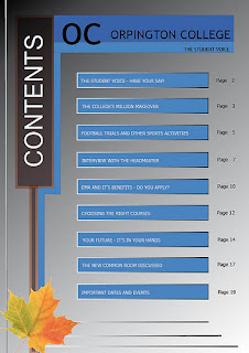
The colours used on the front page are very male orientated. This is because they are blues, greys and blacks. The page doesn't look very bright which isn't very appealing to the eye and it also look quite plain and bland. The brightest thing on the page is the flower in the bottom left corner, which isn't right as it should be the information on the page rather than the rest. The colour of the font is also not very clear on the blue text box. This is because it isn't very readable due to the blue colours used. If they were a lighter colour, it would help the viewing of this page.
The layout of the page is quite simplistic as well. This is because of the fact that it looks very regimental and has little features on the page to help bring it to life, and stand out. The banner down the right hand side, with the blue background colour looks good on the page. This doesn't stand out very well but if the background colour was lighter than grey, it would have a better effect than the current colour scheme.
The lack of images that are on the page helps the attention of the reader to be focused completely on the information that is shown on the page rather than have it spread out. However, the negative aspect of this is that the page looks boring, and will struggle with keeping the attention of the readers.
I don't like the way that the page is laid out, the colour schemes that are used, and the lack of images. When it comes to me making my designs for my contents page, I will need to think carefully about these aspects so that it doesn't look like this example.

Draft Contents Page
Below are the drafts I have created of the contents page. I am going to talk about which one I am going to make and what I like and dislike about all of them.
The top left image I think is quite plain and boring. I am making sure that with all of the text on the page will be positioned in columns as this is how magazines should have their contents page laid out. I have looked at the examples from above and included images into it so that it brings it to life more and makes its overall presentation look better. I think that the layout is good because of the fact that the structure is good. I like the use of the numbers placed in the corners of the images.
The top right corner draft I really like. This is because of the fact that I really like the idea of a double page spread for the contents page, as it allows it to be put on the page clearer and more detailed for it. The fact that there are images on the page that are well laid out help break the page up. I like the use of the numbers inside of the image as well as I think that it looks good. I don't like the way that there isn't a border on the page or a pattern at the side of it, as I think that it would help improve the overall look of the page. I do like the way that the stories are split up, but I don't like the way that there is a really long list of stories. I think that the numbers would look better if they were placed on the side of the stories as opposed to the outside of it.
The bottom right image I think is quite good. This is because I like the way that the sides of the contents page have a pattern incorporated into them. I also like the way that the names of the story sections come out from the side of the patterns so that it allows the actual page and pattern to merge together. The stories have the numbers down the side of them which allow the readers to clearly see if what they are reading is relevant. I like the images across the bottom of the page as it allows a break in all of the information that is shown above them.
The bottom left draft I am not a fan of. This is because of the fact that there seems to be far tom much going on in it. I like the fact that the borders have been incorporated down the sides of it and the web address is across the bottom, that is used in the majority magazines. I like the way that the images are across the top of the document and that there is some on the bottom right side as it helps break the information up on the page so it isn't to harsh on the eye. I don't like the layout of the information that is in the middle of the page, but I do like the fact that the numbers go across both the page and the text.
Out of all of them, I think that the double page spread would be the best contents page to use. This is because I think that looking at the example of the contents page, and my drawings that I have done, I think that this is the best option which would make it the clearest for the readers.

Draft of Final Contents Page
This is the draft that I have chosen to make my contents page on. It is the top right draft from the four that I drew. I think that this one is laid out much better than the other three options were, and for this reason, I have chosen to make this one.

No comments:
Post a Comment